BUSINESS Piead FD

Kamis, 31 Januari 2013

Four Groups... One Long Lesson

A few weeks ago I held a live session on needs analysis for the EVO Designed for Business course.  The course is designed and moderated by some of the most talented trainers I've ever met and it was an honor to be involved.

During the live session, I talked about a common technique I use when the needs of the learner aren't necessarily aligned with what the organization would like to see in the training.  To facilitate both I simply change the context of the task, but not the task itself.  This is nothing new; course books do it all the time.  For example, instead of making arrangements for a business meeting... we make arrangements for a barbeque.  The learners get the 'break from work' so many are looking for, and they are still learning the language and skills needed in their jobs.

However, because I almost never use course books, I instead look for simple things in the learners' lives to exploit for skills practice in the classroom.  During the live session I gave the example of the May Tree, a tradition here in Bavaria.  You can find the live session recording here.

To follow up, I'd like to give an example of how this is scalable to various classes.  In this example, I have taken a different point of view on task based learning.  Instead of one class completing the task over several lessons, various classes work on the task in sequence to complete the overall project.

Lesson Plan:  The Glühwein Stand (Mulled Wine Stand)

Class 1 - Intermediate, 6 Students, 60 min
Objective - Proposing ideas, giving justification, describing purpose, agree / disagree

I explained the task that today we would plan a glühwein stand for the city christmas market (this class was in early December).  The profits would go to charity.  Each class throughout the day would use the work from the class before to take the next step.  For this group, the task was to identify all of the resources needed to start the stand.


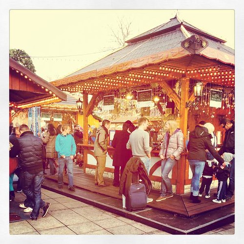
Source:  eltpics, @jeeves_ http://www.flickr.com/photos/eltpics/8197827162

The learners were all given stacks of note cards and told to brainstorm all the things they need.  Write each resource on a different card.  Then they created an affinity diagram in the middle of the table and assigned the resources a catergory name like "Equipment", "Staff", "Materials", "Documentation", etc.

Throughout the lesson, I offered feedback, injected useful phrases, highlighted vocabulary, etc.

Class 2 - Upper Intermediate, 3 Students, 60 min
Objectives - Clarifying, vocabulary for regulations, collocations, syntax, and brevity

At the start of the lesson I gave the group the stack of note cards from the previous group and asked them to 'recreate' the affinity diagram.  The group asked me questions to clarify what the cards meant and the categories.  I recorded and added clarifying phrases on the board.

I then told them to focus on the legal aspects of the stand.  What authorizations would be need?  They researched the information (in German) on the web and had to explain it in English (a common task in their work).  On two websites, I asked them to translate particularly complex sentences, identify collocations, and condense sentences.

Their final task was to create a list of steps to be completed in order to get city approval for the stand.

Class 3 - Pre-Intermediate, 6 Students, 60 min
Objectives - Asking for opinions, stating opinions, saying numbers, talking about budgets

The lesson fit perfectly with the previous lessons in that we has just practiced numbers and talking about costs.  This group was given the note cards from Class 1 and given the task to create a budget for all the resources.  How much do the cups cost?  How much does it cost to rent / buy a stand?  Etc.  Feedback... naturally.

By the end of the lesson they had a catergorized budget on A4 paper.  I ran to the copy machine for the next lesson.

Class 4 - Intermediate, 7 Students, 60 min
Objectives - reach an agreement, discussion options, formal emails for assistance

Finally, each student in the last class was given a copy of the proposed budget from the lesson before.  Their job was to create a profit projection and determine how they could make the most money.  The charity wanted to know how much in donations they should expect before approving the project.  I turned over the white board to one of the learners and got out of the way.  During the discussion they decided that the best way to save money was to ask for volunteers and donations of equipment.  They made a profit calculation and make a list of people / organizations to contact for support.

A natural follow up task was for them to actually write the emails for support.  Each student was given a different contact person and they had to request a donation for the stand (equipment, volunteer support, etc.) or authorization from the charity and government (from Class 2).

By the end of the day I was able to write an email to all of the students and tell them how much money we would donate as a result of their work.  The feedback was great and several suggested that we acutally make it a reality.  I guess that would have to be another lesson.

They used the functional language needed in their work, but the context was something taken from their personal lives.  Combined with doses of feedback... the lessons were very student led and had minimal teacher talking time.

Diposting oleh Unknown di 04.45 Tidak ada komentar:
Kirimkan Ini lewat EmailBlogThis!Bagikan ke XBerbagi ke FacebookBagikan ke Pinterest
Label: classroom management, coursebooks, lesson planning, skills, task-based learning, team building

The Upside of the Under

Political Calculations One-Quarter and Two-Quarter GDP Growth Rate Temperature Gauges, 2012-Q4 First Estimate

Previously, we took the under in forecasting where the United States' GDP would be recorded in the fourth quarter of 2012, forecasting that the nation's real GDP would be recorded below our mid-range projection of $13,726.5 billion in terms of constant 2005 U.S. dollars.

Taking the under turned out to have been the right call for us to make, as the first estimate for inflation-adjusted GDP came in at $13,647.6 billion in terms of the BEA's chained 2005 U.S. dollars, a difference of roughly 0.6% from the value we have projected will be recorded when the BEA finalizes its estimate of GDP for 2012Q4 at the end of March 2013.

We had given 68.2% odds that 2012-Q4's real GDP would fall between $13,583.8 billion and $13,869.2 billion, as the U.S. economy would appear to be continuing to skirt the edge of what we would describe as a microrecession. That condition becomes more apparent as we consider our two-quarter GDP growth rate temperature gauge, where the growth rate for 2012-Q4 falls just into the "cold" purple zone.

Since we base our GDP forecasts on the two-quarter growth rate of GDP, our forecast was largely immune to the large swings in the U.S. federal government's spending for defense that took place in the second half of 2012, where planned spending had been pulled ahead into the third quarter of 2012 to offset potential cuts in this spending as part of the so-called "fiscal cliff" at the end of 2012 and also to provide a boost to the U.S. economy ahead of the national elections on 6 November 2012. Defense-related spending was then sharply reduced in the fourth quarter of 2012, accounting for much of the lackluster GDP growth rate reported in the quarter.

The other major economic event of the quarter, Hurricane Sandy, would appear to have had a negative, but very small effect upon GDP in the fourth quarter of 2012.

Looking forward, using the first estimate of GDP for 2012-Q4, our "modified limo" forecasting technique anticipates that real GDP in the first quarter of 2013 will come in around $13,697.6 billion in terms of constant 2005 U.S. dollars. A positive move, so that's the upside of the under.

Real GDP vs Climbing Limo Forecast vs Modified Limo Forecast, 2004 - 2012-Q4 First Estimate, with Projections to 2013-Q1 and 2013-Q3

We will update our projections as the BEA adjusts its estimates of GDP for the fourth quarter of 2012. At present, we would expect the BEA's estimate of real GDP for 2012-Q4 to be revised slightly upward by the time of their third revision at the end of March 2013.

Elsewhere on the Web

Jim Hamilton offers his analysis of the fourth quarter's GDP figures and points to other viewpoints.

Diposting oleh Unknown di 02.41 Tidak ada komentar:
Kirimkan Ini lewat EmailBlogThis!Bagikan ke XBerbagi ke FacebookBagikan ke Pinterest
Label: gdp, gdp forecast

Rabu, 30 Januari 2013

The Distribution of Net Wealth in the United States

We didn't know this until yesterday, but apparently, our "What's Your Income Percentile?" tool is the second most highly ranked result on Google if you search for "household wealth percentile". Which we found out only because someone who works for the Federal Reserve Board came to our site after performing that exact search on Monday, 28 January 2012!

Well, that's not good enough, is it? We want to own the #1 result for that particular Google search and we're going to get it by building a tool that you can use to see how your household's net worth ranks among all U.S. households!

But first, we'll need to you to determine your household's net worth, for which we'll point you to Bankrate.com's Net Worth Calculator.

Once you have it, enter your household net worth into our tool below, and we'll estimate your percentile ranking among all Americans (as recorded by the U.S. Census in 2010!) [If you're among those Americans who owe far more on your loans than you have assets or who are still underwater on your mortgage and have a negative net worth as a result, enter your net worth as a negative value - just like the default value!]


Household Net Worth Data
Input Data Values
Your Household Net Worth


Your Household's Net Worth Percentile Ranking
Calculated Results Values
Your Household Net Worth Percentile

And now you know just what percentage of U.S. households have a net worth that is equal to or lower than yours! Our chart below shows our model for the distribution of net worth in the United States and how it compares to the data recorded by the U.S. Census.

U.S. Distribution of Net Worth, 2010

That dot in the upper right hand corner? That's the highest net worth we could find for an American, which according to Bloomberg, turns out to be Bill Gates, who had a net worth of over $64.4 billion on Monday, 28 January 2013.

Data Source

U.S. Census Bureau. Net Worth and Asset Ownership of Households: 2010. [Excel Spreadsheet]. Accessed 28 January 2013.

Update 9 March 2013: Retitled from "The Distribution of Net Worth in the United States".

Diposting oleh Unknown di 02.45 Tidak ada komentar:
Kirimkan Ini lewat EmailBlogThis!Bagikan ke XBerbagi ke FacebookBagikan ke Pinterest
Label: data visualization, demographics, tool

Selasa, 29 Januari 2013

Find Your Age-Based Income Percentile Rank

Building on our previous data visualization exercise, we've now gone the extra mile and built a tool you can use to estimate what your percentile income ranking is for your age group!

U.S. Distribution of Income by Age Group, 2012

Just enter your data in our tool below, and we'll do the math, which is based on the age-based distribution of income in the United States for 2012 as reported by the U.S. Census Bureau.


Age and Income Data
Input Data Values
Select Your Age Group
Enter Your Total Money Income


Where You Rank Among Your Age Group
Calculated Results Values
Your Income Percentile Ranking Within Your Age Group

Some quick notes - the data from which we built this tool doesn't provide a lot of detail at either the lowest end of the income spectrum or at the highest end. As a result, if your entered income places you below the 5th percentile or above the 95th percentile for your age group, we can only tell you that you fall into that percentile range as our tool's accuracy appears to break down below and above those levels.

We're also experimenting with how to incorporate the code behind our tool directly in this post. If you find the tool doesn't work when you first try to access it on our site, please check back later - we'll have it up and running as soon as our time allows.


Diposting oleh Unknown di 03.02 Tidak ada komentar:
Kirimkan Ini lewat EmailBlogThis!Bagikan ke XBerbagi ke FacebookBagikan ke Pinterest
Label: demographics, income distribution, tool

Senin, 28 Januari 2013

From Order to Chaos and Back Again

Today, we're going to summarize the major trends of the last 22 years in the U.S. stock market as represented by the S&P 500 in a single chart as we introduce some of our analytical methods to our new readers.

To get up to speed with the information we're presenting, you should be aware that we've demonstrated over the last several years that the stock market typically operates in one of two states, which we've characterized in our most ground-breaking analysis as being either in a state of order or in a state of chaos.

During periods of order, both stock prices and their underlying dividends per share are closely coupled with each other, so much so that the variation in stock prices about a major trend defined by the same kind of simple power law that shows up all over nature, and which we've found can be described by the math of normal statistical distributions. During periods of chaos however, stock prices and dividends per share become decoupled from one another as a different kind of order takes hold as stock prices explode into Lévy flight, for which we've developed a different kind of math to describe and anticipate.

With that background now in place, here's our chart showing how the S&P 500 has swung from order into chaos and back again since December 1991:

S&P 500 Average Monthly Index Value vs Trailing Year Dividends per Share, December 1991 to January 2013 (as of 25 January 2013)

What makes this chart different from the one we last presented in September 2012 is that we've gone into greater detail in identifying the major influences that have dominated the U.S. stock market since the last major period of order ended in December 2007.

Here's our quick guide to each of the major periods of either order or chaos in the U.S. stock market since December 1991:

Order: December 1991 to April 1997 (Post Gulf-War Peace)

Following the disruptive event of the Gulf War, stock prices were closely coupled with dividends per share in the period through much of the 1990s, ending in April 1997.


Chaos: April 1997 to June 2003 (The "Dot Com" Stock Market Bubble)

Stock prices became decoupled from their underlying dividends per share when the U.S. government suddenly opened up the gap in the tax rates that applied to dividends and capital gains at the end of April 1997. With the tax rate on capital gains suddenly so much lower than it had been, an imbalance favoring non-dividend paying stocks exploded in what became known as the "Dot Com" stock market bubble, after the early Internet-related companies whose stocks benefited from the change in the nation's tax laws.

The inflation phase of the bubble continued until the bubble peaked and popped in August 2000, sending the nation's economy into recession as stock prices plummeted. The deflation phase of the bubble then continued until June 2003.


Order: June 2003 to December 2007 (The Bush Tax Reform)

On 28 May 2003, President George W. Bush signed the Jobs and Growth Tax Relief Reconciliation Act of 2003 into law, setting the same single tax rate for both dividends and capital gains and ending the imbalance between the two. Order quickly resumed as stock prices and dividends per share once again became closely coupled with one another.

Chaos: December 2007 to March 2009 (The 2008 Crash)

Order in the stock market came crashing to an end as stock prices began plummeting in January 2008 given a high level of distress in the U.S. banking and financial industries, which erupted into an extremely deep crash as the U.S. automotive industry saw the failure of both General Motors and Chrysler after August 2008 thanks to a very large spike in oil and gas prices that killed demand for these companies' gas-guzzling product lines. Stock prices ultimately bottomed on 6 March 2009 as China outlined how it would implement a massive economic stimulus program that would boost the entire world economy.


Chaos: March 2009 to April 2010 (Post Crash Recovery and QE 1.0)

With the bottom now in place, U.S. stock prices began to respond positively to a change of outlook for U.S. companies as the rate of descent for their expected future dividends began to slow and reverse.

The Federal Reserve also implemented its first quantitative easing program (QE 1.0) in March 2009, however it didn't have much impact in affecting stock prices until after February 2010, as it generated a rapidly inflating bubble in stock prices as trailing year dividends per share finally bottomed after the crash.


Chaos: April 2010 to August 2010 (The QE 1.0 Bubble Deflates)

As sharply as stock prices inflated with respect to dividends per share in their rapid rise after February 2010, they deflated just as quickly after QE 1.0 came to an end at the end of March 2010, with stock prices falling back to their February 2010 level by June 2010, just as order finally returned to the stock market as stock prices and dividends per share began to re-couple together.


Order: August 2010 to August 2011 (The QE 2.0 Bubble)

Although order technically returned to the stock prices after June 2010, the Federal Reserve's announcement that it would implement a new phase of quantitative easing (QE 2.0) near the end of August 2010 soon boosted stock prices with respect to where they had just stabilized with respect their dividends per share. The resulting bubble in stock prices continued for a full month after QE 2.0 ended on 30 June 2011, with stock prices finally falling back to where the equilibrium established in the new period of order would place them in the absence of an effective ongoing quantitative easing program by the Fed.


Order: August 2011 to Present (The Current Period, at least through January 2013)

Since August 2011, the relationship between stock prices and their underlying dividends per share has largely been stable, except for a brief period from December 2011 to May 2012 which was characterized by speculation with respect to the stock of Apple (NASDAQ: AAPL).

Here, a dramatic run-up in the stock began after it bottomed in mid-December 2011 on the speculation that Apple would initiate a new dividend. The stock then rose some 67% before peaking on 9 April 2012, just three weeks after Apple made its official dividend announcement. The company's stock price then quickly fell back by the end of May 2012 to where it then would follow a much less speculation-driven trajectory.

The company stock price has had an outsize effect on the valuation of the U.S. stock market during this period, as it has competed with ExxonMobil (NYSE: XOM) for being the largest company in the S&P 500 by market capitalization for much of the last year.

That brings us up to today, as the stock market is continuing its rally since mid-November 2012, where some of the rise in stock prices might be perceived to be due to the "magical" phenomenon of mean reversion. However, we've found that there are much more fundamental factors at work behind the rally using our chaos-based stock market analysis.

So there you have it - 22 years of the stock market explained in one chart. We'll close by observing that the Federal Reserve has once again initiated a new round of quantitative easing in December 2012, similar to what it did with QE 1.0 and QE 2.0, which we'll call QE 4.0, as the previously announced QE 3.0 was different in that the Fed focused solely on buying up mortgage backed securities instead of buying up U.S. Treasuries as well. At this point, it is still too early to tell if the Fed's newest round of quantitative easing will have the same impact on stock prices with respect to their dividends per share as the previous rounds appear to have had.

If it does, we'll know shortly, as the current period of order in the stock market gives us the means to determine what impact that might be with the analytical methods we've invented during the last several years.

This is a big part of what we do here at Political Calculations. Welcome to the cutting edge....

Diposting oleh Unknown di 02.51 Tidak ada komentar:
Kirimkan Ini lewat EmailBlogThis!Bagikan ke XBerbagi ke FacebookBagikan ke Pinterest
Label: chaos, SP 500

Minggu, 27 Januari 2013

Talk So People Will Listen; Listen So People Will Talk

So I've started doing Hangouts on Google+ with Don Purdum and he really likes topics like transparency, communication and such.  He's truly pushing me to open up.  I think I like it, but I'm not quite sure.  I keep thinking he's going to press me to open up about something crazy soon!  Join us every Tuesday morning at 9:30 AM LIVE to see what happens.  Or just subscribe to this blog.  I'll probably post most of them.


Anyway, listen to us talk about keys to better communication in relationships and in business.  Click HERE or on the graphic above to begin the video!  We're having fun doing these and hope you're getting good stuff out these!  One thing I enjoyed discussing was "His Needs, Her Needs" and the importance of intimacy, honesty and openness in communication with our partners!

What else can we talk about for you?


Mark Anthony McCray helps people live on PURPOSE, achieve higher PERFORMANCE and experience true PROSPERITY. Be sure to subscribe to this blog so you don't miss a thing and forward this to a friend if you found it helpful. All material © Copyright, Mark Anthony McCray unless otherwise noted!

He can be reached in the following ways:

Mark@LiveBIGDieEmpty.com
Phone: 281-846-5720
Twitter: @LiveBIGDieEmpty
Facebook: http://www.facebook.com/LiveBIGDieEmpty
LinkedIn: http://www.linkedin.com/in/markanthonymccray/
Google+: https://plus.google.com/u/0/103149858138414160703/posts
YouTube: http://www.youtube.com/user/markanthonymccray
Pinterest: http://pinterest.com/markmccray/

For more information on Mark as a speaker or presenter check out http://livebigdieempty.blogspot.com/p/about-mark_29.html
Diposting oleh Unknown di 18.53 Tidak ada komentar:
Kirimkan Ini lewat EmailBlogThis!Bagikan ke XBerbagi ke FacebookBagikan ke Pinterest

Jumat, 25 Januari 2013

Prepare For What You've Prayed For!


"Be Prepared." That's the Boy Scout motto. It's also my word for today.

I have shared with you, my friends, a few times before that I believe the Lord shares things with me in dreams regarding direction for my life, encouragements and (sometimes) warnings.  This happens a few times a month for me, typically, and I post them here when I feel the unction that someone else could benefit.  Today is another of those days...

The word of the day is "Prepare" for some of you.

In my dream, I was attending a large convention as one of the featured speakers.  Large gathering.  Convention center.  There appeared to be something in the range of 5000 people attending.  I didn't have a problem with the material or size of the crowd.  But I wasn't ready.

As I waited in the private lounge wherein I was supposed to be getting dressed, I realized I didn't even have my suit with me.  It was in the car.  I had only brought my shoes inside in my travel bag.  As the presenter before me hit the place in his speech where I knew there were only fifteen minutes left before I was to go on, I found myself running around frantically.  I was not going to be ready on time.  I was going to be late.  There was no way to be ready on time by this point.  None!

I was going to be late.  I was going to make a bad impression on the crowd and organizers as they would have to tap dance around for a few minutes while I got dressed.  Late!  Ouch!  Future opportunities missed!

Oh well.

Here's the thing.  The Lord is telling me to prepare for what I've been praying for.  For some of you, you're in the same place.  I KNEW it was almost time for me to come forward.  I was in the right place for it.  But I had not prepared.  What a shame!  What a tragedy!  How terrible to know your day is coming, have a chance to be ready to take full advantage of it and STILL not be ready!!

That's the word for today: Your prayers are about to be answered so prepare for what you prayed for.  Don't allow God's blessings to catch you off guard.  He's heard your request and doors are about to open.  Be ready to walk through them!


Mark Anthony McCray helps people live on PURPOSE, achieve higher PERFORMANCE and experience true PROSPERITY. Be sure to subscribe to this blog so you don't miss a thing and forward this to a friend if you found it helpful. All material © Copyright, Mark Anthony McCray unless otherwise noted!

He can be reached in the following ways:

Mark@LiveBIGDieEmpty.com
Phone: 281-846-5720
Twitter: @LiveBIGDieEmpty
Facebook: http://www.facebook.com/LiveBIGDieEmpty
LinkedIn: http://www.linkedin.com/in/markanthonymccray/
Google+: https://plus.google.com/u/0/103149858138414160703/posts
YouTube: http://www.youtube.com/user/markanthonymccray
Pinterest: http://pinterest.com/markmccray/

For more information on Mark as a speaker or presenter check out http://livebigdieempty.blogspot.com/p/about-mark_29.html
Diposting oleh Unknown di 10.25 Tidak ada komentar:
Kirimkan Ini lewat EmailBlogThis!Bagikan ke XBerbagi ke FacebookBagikan ke Pinterest

Kamis, 24 Januari 2013

A Positive Dip for New Jobless Claims

Since 23 September 2012, the weekly data for seasonally-adjusted new jobless claims has been especially volatile.

The data reported last week, which applies for the week ending 12 January 2013, would appear to be more of the same. At least, that's what you might first think when you see where the data falls with respect to our statistical equilibrium chart of the trends in new jobless claims:

Residual Distribution for Seasonally-Adjusted Initial Unemployment Insurance Claims, 19 November 2011 - 12 January 2013

It looks just like an outlier, right? And truth be told, it definitely is. However, this outlier is not like the others, where we were able to easily identify the cause of the discrepancy with respect to the trend.

Instead, we think something positive might be at work. If it's what we think it is, the low number of initial unemployment insurance claim filings will be with us for another week, which we'll find out later this morning. The bad news is that it won't continue to be with us for much longer than that.

That positive something else is gasoline prices hitting their lows for 2012 some two to three weeks earlier, between 22 December 2012 and 29 December 2012. Here, the national average for retail motor gasoline prices dropped below $3.25 per gallon but more significantly, it dropped near and below $3.00 per gallon in large sections of the United States.

After having been elevated well above that level for the past two years, that threshold might very well mark the point where consumers believe gasoline prices are low, which in turn, might spark extra spending on their part thanks to the related boost in their discretionary income. That in turn would lead employers to retain higher levels of their employees, which would result in a lower level for new jobless claims!

This is very much the flip side to our hypothesis that there is a "high" level for gas prices in the U.S., which we've observed to kick in around a national average price at the pump of $3.50 per gallon. At this level, employers react to consumers having less of their income to spend on other things and the resulting loss to their business revenue by laying off larger numbers of their employees.

We've long noted that there is a 2 to 3 week lag between events like this occurring to when it shows up in the new jobless claims data. That's because most employers are "locked in" to their current payroll cycle - any employee retention decisions they make will take effect with their next payroll cycle. In the United States, with most employers issuing paychecks on an either weekly or biweekly basis, it then takes 2 to 3 weeks for the impact of any layoff decisions to fully show up in the data.

We say that this effect will be short lived, because the extra economic activity that might be associated with this positive factor will disappear after people begin receiving their 2013 paychecks, in which they will see a 2% reduction in their take-home thanks to the expiration of President Obama's Social Security payroll tax cut from 2011.

For a typical American household, that additional money now going to the U.S. government would be the rough equivalent of a sudden $1.40 per gallon increase in the price of motor gasoline in the United States.

The impact of that change will be progressively felt as employers change the amount of their tax withholding on behalf of the U.S. government in 2013. All paychecks should reflect the higher payroll tax by 15 February 2013 and most should see it for paychecks issued in mid-January.

Then again, the sudden dip in new jobless claims could be another data reporting problem, much like California's episode of incompetence back on 6 October 2012. Either way, we'll know what was behind the dip in new jobless claims within the next several weeks.

Diposting oleh Unknown di 05.18 Tidak ada komentar:
Kirimkan Ini lewat EmailBlogThis!Bagikan ke XBerbagi ke FacebookBagikan ke Pinterest
Label: jobs

Rabu, 23 Januari 2013

In Which We Deny A Request to Remove a Link from Our Site

We received a pretty unusual e-mail earlier this week from an individual at OnlineDegrees.net. Here is the text, which we'll present in snippets with our responses in between:

G'day,

G'day! How ya goin mate?

Not long ago, Google began reviewing websites for their past linking practices. They are looking for "over-optimized" back-links. What this means is that they are looking for links from one site to another that use the term that most users search for to find particular pieces of information. OnlineDegrees.net is one of these sites under review for bad practices.

Do tell! You've been very bad, haven't you?

While I appreciate your efforts to share our content and give credit where credit is due, I must respectfully request that you remove all links to OnlineDegrees.net from your site: politicalcalculations.blogspot.com

Let's see.... OnlineDegrees.net, OnlineDegrees.net, OnlineDegrees.net.... Doesn't ring any bells - are you sure that we've ever linked to OnlineDegrees.net?

This includes the links found on: politicalcalculations.blogspot.com/2010/04/cavalcade-of-risk-102.html

Oh, that one! Where we posted a link specifically submitted by OnlineDegrees.net to the edition of the Cavalcade of Risk blog carnival that we hosted back in April 2010.

That would be the very well-received edition of the Cavalcade of Risk where we shared your content and gave credit where credit was due by assigning OnlineDegrees.net's submission our second-lowest blog carnival contribution rating of Cc3, which is a rating that warns readers against clicking through to the contribution by describing the information at the link submitted by OnlineDegrees.net as being "Way off topic, might possibly make you stupider and also potentially painful".

We're pretty sure then that Google doesn't have a problem with how we've linked to OnlineDegrees.net. But why pursue this now, after more than two years?

We are updating our site to improve content and design, so I hope that you will return to see the information our site provides once this issue is resolved. Please send me an email, letting me know if and when you have removed our links from your site, or if you have any questions or concerns. I very much appreciate your help.

No, we can't say as that we have any questions or concerns. Your request for us to remove the link submitted by OnlineDegrees.net to the 102nd edition of the Cavalcade of Risk blog carnival that we hosted in April 2010 is denied.

And just so that the original post that earned our Cc3 blog carnival rating isn't lost as part of the update to OnlineDegrees.net's content and design, here is the Internet Wayback Machine's archived file of the content OnlineDegrees.net submitted to be included with that edition of the Cavalcade of Risk we hosted.

Thank you,

[NAME AND E-MAIL ADDRESS REDACTED]

P.S. I apologize if you received a request from us more than once. We are being assertive in our efforts to fix this.

We hope our public response works in place of the e-mail response you requested, as we've likewise chosen to be assertive in our efforts to deny your request as we stand by our editorial content.

We wish you the best of luck with your updates to OnlineDegrees.net's content and design. Although we've only ever linked to your site on just two occasions, should we ever disregard our own advice and click through the links we've posted to OnlineDegrees.net, we would certainly welcome improved content and design.

You're welcome,

Ironman at Political Calculations

Diposting oleh Unknown di 03.36 Tidak ada komentar:
Kirimkan Ini lewat EmailBlogThis!Bagikan ke XBerbagi ke FacebookBagikan ke Pinterest
Label: none really

Selasa, 22 Januari 2013

Predictions for 2013


What lies ahead for the world of business in 2013?  

Business predictions for 2013
"I see President Obama's hair getting whiter and whiter in the coming year.  I see Apple Inc. getting into the market for crystal balls that will integrate seamlessly with the internet (uh oh).  I see history books devoting less and less space to the Mayans." 


This year, there are no end of the world predictions to fret about.  The Mayans got it wrong last year, which is too bad for them, because their once formidable reputation as  advanced civilization darlings of the first millenia BCE has been badly tarnished.

Do you hear anybody talking about a double dip recession anymore?  Me neither.   Despite the political dysfunction in Washington, talk about a double dip recession has all but disappeared.

There was great concern in 2012 that the Euro would collapse, and Greece would exit the European Union.  That didn't happen, thanks to the intervention of the ECB and the International Monetary Fund.  In fact, one of the biggest market jumps in 2012 came in the Athens stock exchange, where stocks rose 33 percent!


A slowdown in the Chinese economy had everybody pretty worried for a while in 2012. But China's export growth rebounded surprisingly sharply to a seven month high in December, allaying world wide concerns.

Yet, no one is exactly cheering.  We've gotten past the fiscal cliff, though many feel the deal reached between the Democrats and Republicans was nothing more than a band aid - a necessary, but pathetic compromise - and the country still faces the looming debt ceiling showdown in March.


The global economy is expected to remain sluggish in 2013, with the European Alliance still in recession.  Top Federal Reserve official Charles Evans said recently that the U.S. economy is expected to grow at a rate of 2.5 percent - a far cry from the 4.2 percent growth grate the Obama administration had originally projected.  The unemployment rate remains elevated at 7.8 percent, and employers are showing little inclination to begin hiring again. Nevertheless, a quiet optimism has emerged as the various threats of global economic catastrophe have receded. 


There is a wide consensus that emerging markets will outperform the U.S. stock market in 2013. Adam Shell, writing in USA Today, also sees an improving economy in western Europe, which has been aided by bond buying by the ECB.  The European Central Bank gave the European Union a big boost last year, when it offered to buy unlimited debt of heavily indebted countries such as Spain and Italy. Mr. Shell believes that U.S. stocks will notch an all time high, but that U.S. stocks with foreign exposure will fare better than those that are United States centric. 


Byron Wien, Vice Chairman and a senior adviser at Blackstone predicted last year that the S & P would close over 1400.  The index, in fact, ended the year at 1,426, representing a gain of 13.4 percent for the year.  However, while many others are predicting new highs for the S & P in 2013, Mr. Wien expects the index to test 1,300 again before climbing back to just about where it finished at the end of 2012.  But, like many others, he is optimistic about stock markets in some other countries, especially China and Japan. Mr. Wien predicts a 20 percent gain this year for Chinese shares.


Bill Gross, the highly regarded bond manager of Pimco's giant Total Return Fund, last year predicted a good year for tax free municipal bonds, which he called a "deserted" asset class.  He was right.  The Total Return Fund returned over 10 percent in 2012.  But Mr. Gross is less enthusiastic about the prospect for healthy returns from municipal bonds in 2013.  "I'm afraid there are going to be ashes in our stocking this year," he said.  "The juice has been squeezed out of the orange."


What's in store for the housing market in 2013?  Karl Case, who helped create the widely cited Case-Shiller Index of housing prices feels that there are lot of reasons to be optimistic, going into the new year. According to Mr. Case, 2012 will probably go down as the year that residential real estate prices hit bottom and began to rise again. However, he is careful to point out that the recovery isn't going to knock anybody's socks off.  "We're cheering because we got to 800,000 housing starts. That's still weak. It only looks good because we dug ourselves into such a deep hole." But Mr. Case says this year would be a good time to buy.  "There are a lot of reasons to be optimistic, but cautiously so."


Remember the mad rush to buy gold in the early part of 2012? At the beginning of the year, everyone was betting that the price of gold would break $2,000, including Maria Bartiromo and Jim Cramer. However, in the final quarter of 2012, after everybody finally climbed on the band wagon, gold prices posted their worst quarterly performance in more than four years, falling more than five percent. What's ahead for gold in 2013? With the global economy tipped to recover in 2013, analysts are forecasting the end of the 13 year bull run for the metal. 


The massive surge in gold prices in the early part of 2012 and the sharp decline in the last quarter brings to mind the great Apple bull run of 2012 - which also ended with massive exodus from the stock, driving its share price from a high of $706 to a shaky range just above $500.  Last year, Mashable predicted that "the year of Apple, Inc. is at hand.  Apple will release a triumvirate of products, including a super slim edge-to-edge screen iPad 3, the long awaited iPhone 5 and an Apple TV...which will seamlessly integrate with the internet."  Many analysts predicted that the stock would reach $1,000 per share.


Nevertheless, Mark Rogowsky, writing in Forbes says that 2013 is the year in which Apple bears get skewered.  He says, "look for a cheaper iPhone (around $400 to carriers), faster product refreshes to become the norm (as with the 4th generation i Pad), and a deal with China Mobile later in the year.  CEO Tim Cook makes explicit that the company is unwilling to cede the global market-share to Android and instead will compete as vigorously abroad as it does in the U.S., where iPhone share remains strong.  Apple ends the year at $800. And he adds, "Oh, and it might be the safest stock to own right now."


In the world of entertainment:  According to Forbes, Wall Street predicts that the second installment in the Hunger Games series - Catching Fire - will be the "biggest blockbuster of the year."  I loved the Hunger Games trilogy.  But that's not why I'm rooting for Jennifer Lawrence over Kristen Stewart of the Twilight series.  She seems less likely to cheat on her boyfriend and sleep with her director. 


Finally, Jack Blumner, Executive Director of the Executive Office Center at Fresh Meadows, believes that the virtual office business model will continue to attract small companies in droves. "Increased confidence will bring businesses back into the market for office space, but they will be seeking less risk and greater profitability by avoiding the high costs associated with traditional office space," And, he adds, "the Executive Office Center at Fresh Meadows will continue to provide the most economical rental platform in the the borough of Queens."

Diposting oleh Unknown di 06.33 Tidak ada komentar:
Kirimkan Ini lewat EmailBlogThis!Bagikan ke XBerbagi ke FacebookBagikan ke Pinterest
Label: business forecast for 2013, business predictions for 2013, economic forecast for 2013, economic predictions for 2013, new year predictions, predictions for 2013
Lokasi: 61-43 186th Street, Queens, NY 11365, USA

How Long Do You Have Left to Live at Age 65?

We have a project we're working on behind the scenes here at Political Calculations, where we keep having to work backward in time to figure out when an average American man or woman who has reached Age 65 in a given year was born, and then forward in time to project the year to which they can reasonably expect to live if they have the same average remaining life expectancy of a man or woman who reached Age 65 in the year that they did!

So rather than keeping doing the math, we've constructed a couple of visual aids to make it quicker to get our answers. First, we've tapped the U.S. Centers for Disease Control's data for remaining life expectancy for people who reached Age 65 in each year from 1950 through 2009:

Remaining Life Expectancy at At 65, 1950 - 2009

And then, using that data, for the birth years that correspond to the year in which the American men or women turned 65, we worked out the year to which these individuals can reasonably expect to live given the CDC's remaining life expectancy estimates, which we've presented in our second chart below.

Well, not so fast. Since that data, while useful for our purposes, would make for a pretty uninteresting chart to share with all of you, we've added some extra information to it. We've identified the range of birth years that would correspond to the legal minimum (17) and maximum (45) ages of enlistment for military service in World War 2, along with a special range that corresponds to those who would have been 26 years old during the war - the average age of U.S. servicemen in the Second World War.

Year to Which an Average U.S. Man or Woman Can Expect to Live, Provided They Have Reached Age 65 and Have Average Remaining Life Expectancy

If you look closely, those aren't straight lines in the chart above - they actually curve upward ever so slightly!

Some Cool Facts

The oldest living Congressional Medal of Honor winner from World War 2, Nicholas Oresko, just turned 96 years old on 18 January 2013, which puts his birth year of 1917 right in the middle of our highlighted "Age 26 during World War 2" range.

We note that the youngest legally-enlisted servicemen, those born in 1928 who would have been Age 17 in 1945, could reasonably have expected to live to 2008, given the average life expectancy for people born in that year who later turned Age 65 in 1993. By that standard, every veteran of WW2 alive today is someone who has lived longer than the average American born in the same year they were.

Here's hoping that all the remaining veterans of WWII continue to exceed the average American's lifespan expectations!

Diposting oleh Unknown di 03.00 Tidak ada komentar:
Kirimkan Ini lewat EmailBlogThis!Bagikan ke XBerbagi ke FacebookBagikan ke Pinterest
Label: data visualization, demographics

Senin, 21 Januari 2013

What Is Really Behind the Rally in Stock Prices?

Craig Newmark points to some interesting analysis that suggests that the recent run-up in U.S. stock prices can be attributed to the newest rounds of quantitative easing:

What is clear is that the recent market rally is once again being driven by the Federal Reserve's QE programs. Money is flowing out of bonds, and the dollar, and into equities. The weekly chart below shows the decline in the market this past September and October as excess reserve balances with the Fed were drawn down. The subsequent rally has been fueled by the Fed as it has pumped reserve balances sharply higher.

But here's the thing. The rally started a month too early for the Fed's QE efforts to be responsible for it. Here, the Fed's latest QE efforts (let's call it QE 4.0) really only began properly on 12 December 2012. The rally, on the other hand, began after stock prices bottomed on 15 November 2012 - a month before the Fed announced it would expand its balance sheet and long after the previous generation QE 3.0 was initiated in August 2012.

So the Fed's quantitative easing isn't behind the stock market rally. Instead, we can demonstrate that investor expectations for future dividends is behind it.

Following the 6 November 2012 national elections in the U.S., influential investors began racing the clock to beat the expiration of low tax rates for dividends after the end of the year, which were now guaranteed thanks to the outcome of the elections.

Beginning after the market's close of business on 15 November 2012, large numbers of U.S. companies began announcing that they would pay out extra or special dividends before the end of the year.

That activity focused investors on the fourth quarter of 2012 for setting stock prices, which began rising along with investor expectations for the dividends that would be paid out before the end of the year.

That activity continued up through 20 December 2012, which marked the end of the dividend futures contracts for the fourth quarter of 2012.

After that point, investors shifted their attention to a more distant point in the future - to the second quarter of 2013. Stock prices have continued to rise in the rally because they started the month at a level below where the expected change in dividends per share for 2012-Q2 would place them. Today, investors remain focuses on 2013-Q2 in setting stock prices, which we observe as the change in the growth rate of stock prices converging with the expected change in the growth rate of dividends per share for that future quarter.

Our animated chart below shows this transition in the period from 20 December 2012 through the futures for 21 January 2013, along with the shift in focus of investors from 2012-Q4 to 2013-Q2, which you can see as the sudden 5-month leftward shift of the green/red trailing year future dividends per share acceleration data.

Animated Accelerations of S&P 500 Average Monthly Index Value and Trailing Year Dividends per Share, for Futures Through 20 December 2012 through 20 January 2013

And that's why the rally that began back on 15 November 2012 has continued to run. Investors had better hope that the Fed's latest QE efforts start affecting asset prices soon, because the alternative future points in time for where investors might next choose to focus their attention in setting stock prices aren't as pretty.


Diposting oleh Unknown di 03.39 Tidak ada komentar:
Kirimkan Ini lewat EmailBlogThis!Bagikan ke XBerbagi ke FacebookBagikan ke Pinterest
Label: chaos, SP 500

How to Create a Great E-Learning Environment

After having taken a nice long vacation from email, the Internet, Twitter, and my blog, I am feeling recharged and ready to start 2013!  It is clear for me that 2013 will be a year of growth in e-learning and managing training virtually.  So I thought I would start by recording what I have learned so far.

For those who do not know, I never finished my university diploma.  I dropped out of college due to financial constraints and "other pursuits" in 2001 and it has haunted me ever since.  So in 2010 I restarted my journey toward societal acceptance by enrolling in online study from the University of Maryland to obtain my BS in Marketing.  Over the past two years I have seen all sorts of teaching, moderation, tasks, and so on from the professors of the university.  Combined with my limited experience in conducting training online, I'd like to share...

Best Practice in Online Learning or How to manage an asynchronous online conversation...

1.  Start off with a general introduction

One of the over-arching themes of adult online learning is that the participants place their daily lives on hold during the course.  They are extremely interested in really getting to know the other people in class and friendships come naturally.  Therefore, it is best to leave the personal introduction task as general as possible.  In fact, the wording, "Post an introduction of yourself," is typically sufficient to build a proper collaborative network.  This type of task will truly encourage the learners to read and remember the posts of their peers.

2.  Reduce teacher talking time

Teachers should moderate the discussion as little as possible.  Remember, the key aspect of online learning is that the learners "find their own path".  Any guidance, correction, or feedback will only disrupt that process.  Besides, feedback is generally best when withheld until grading an assignment.

Additionally, because the participants are reading all of the other posts there is no need to refer to the opinions of other class members.  Saying things like, "Interesting point of view, but I think Jenny might disagree," is simply a waste of time.  The learners will have already read the post and in fact are probably already preparing a response.  The same is true for links to additional material.  One characteristic of adult learners is that they are only interested in learning the material provided in the course.  Optional links and 'for more information' resources are seen as disruptive.

3.  Set rules about how often and when posts must be written

The real value of an online forum is the number of posts the class can write.  This shows real collaboration.  The quality of the ideas is only secondary.  Therefore, your learners will truly benefit from rules like, "Post your response by Tuesday, one reply to another classmate by Friday, and two more replies by Sunday."  These rules ensure that ideas are spread and that everyone is getting the most from the discussion.  Furthermore, it will help the learners manage their lives better and assist them in prioritizing their tasks.

4.  Focus on the theory

Adult learners are fascinated by theoretical learning.  In surveys, most respondents say what they enjoy most is reflecting on theoretical tasks and coming up with ways to apply them to their real world situations.  By providing practical tips and applications, the teacher is only robbing the learners of this opportunity.

5.  Rewards and praise often fall flat in adult courses

It is a universally accepted truth that only children respond well to praise and reward for positive effort and results.  For adult learners the reward is the course itself (and naturally any certification).  Therefore, providing positive comments to good ideas or dedication to the group should be minimized.  The learners will undoubtedly find it condescending and resent the trainer.  Along with this, competitions and games should be removed completely from the adult online training environment because it will only cause further demotivation.

6. Keep tasks open ended

When giving instructions, remember to keep them as general as possible.  Use vague verbs like discuss, reply, and consider because these will yield the best results for online discussion.  Also, because adult learners are continually focused on achieving the learning objectives, there is no need to inform them of the purpose behind the individual tasks.  The extensive introduction document you send at the beginning of the course will be read with vigour and the learners will clearly see how everything fits together.  Giving a purpose is simply redundant.

7.  Summarize activities are the best

Perhaps the best online discussion activity is to ask the learners to summarize a document, chapter, website, etc.  The most effective way to generate differences of opinion is to have 30 responses which all say the same thing.  The students will discuss continuously about why and how one summary is different than others.

So those are my lessons learned for effective e-learning.  Happy moderation and I hope you have a great new year!
Diposting oleh Unknown di 03.04 Tidak ada komentar:
Kirimkan Ini lewat EmailBlogThis!Bagikan ke XBerbagi ke FacebookBagikan ke Pinterest
Label: classroom management, e-learning, team building, virtual training

Sabtu, 19 Januari 2013

Fast Food Free?


I just started this event if anyone wants to join me and share tips and testimonies! Health gurus welcomed! JOIN MY FACEBOOK EVENT AND SHARE YOUR TIPS!

Here's my motivation.  I was sitting with a consulting prospect the other day and got an unexpected tidbit of advice. Heavily-accented English and blunt the way only older men are blunt when they speak.  As we talk, he leans into me and says "You see that park over there? I walk every morning.  You should try it." while somewhat glancing at my little-bit-of-a-belly.  There's not much worse than a prospect calling you fat.  Mind you.  I am NOT FAT by American standards, but people from other countries tend to look at us like we're pigs.  And, I'll grant him this.  He looked great for a man who's probably closer to seventy than to fifty.

I work out quite a bit.  A few times a week anyway.  I could look really good and also have my blood pressure and other metrics in line if my diet was better.  You can never out work a bad diet.


I think cutting foods that I get at drive-thrus out will by itself be a huge improvement!

As I always say: "You can't Live BIG or Die Empty from a sick bed!"  Join us!!  What are your tips for eating better?


Mark Anthony McCray helps people live on PURPOSE, achieve higher PERFORMANCE and experience true PROSPERITY. Be sure to subscribe to this blog so you don't miss a thing and forward this to a friend if you found it helpful. All material © Copyright, Mark Anthony McCray unless otherwise noted!

He can be reached in the following ways:

Mark@LiveBIGDieEmpty.com
Phone: 281-846-5720
Twitter: @LiveBIGDieEmpty
Facebook: http://www.facebook.com/LiveBIGDieEmpty
LinkedIn: http://www.linkedin.com/in/markanthonymccray/
Google+: https://plus.google.com/u/0/103149858138414160703/posts
YouTube: http://www.youtube.com/user/markanthonymccray
Pinterest: http://pinterest.com/markmccray/

For more information on Mark as a speaker or presenter check out http://livebigdieempty.blogspot.com/p/about-mark_29.html
Diposting oleh Unknown di 18.44 Tidak ada komentar:
Kirimkan Ini lewat EmailBlogThis!Bagikan ke XBerbagi ke FacebookBagikan ke Pinterest

Jumat, 18 Januari 2013

Visualizing the 2012 Distribution of Income in the U.S. by Age

Where do you fit in the 2012 ranking of total money income by age group in the United States?

While we've previously built a tool where you can find out your percentile ranking among all individuals, men, women, families and households in the U.S., we thought it might be fun to break the data for individuals down a little differently - by age group!

Our chart below reveals what that distribution looked like for 2012, as indicated by the curves showing the major income percentiles from the 10th through the 90th percentile for each indicated age group on the horizontal axis.

U.S. Total Money Income Distribution by Age, 2012

The data in the chart represents the income distribution for the estimated 194,271,175 Americans from Age 15 through Age 74. As such, the space between each of the percentile curves on the chart then covers the total money income of some 19.4 million individual Americans.

What stands out most in the chart are the changes in the vertical spread between the 10th, 50th and 90th percentiles by age group, which might be taken as a measure of the relative income inequality for each age group. For example, we see the Age 15-24 group seems to have the greatest income equality, with the least amount of vertical separation between each of the income percentile thresholds.

We said "seems" for the Age 15-24 group, because believe it or not, this group has the highest income inequality of any age group as measured by the Gini index. The reason why has to do with the high concentration of very low income-earning individuals within this age range (for example, about 50% of all minimum wage earners are found in this age group!), against which a relative handful of very talented young people, including entertainers and star athletes, go straight from their school years to multi-million dollar incomes, often before many of these individuals see their careers flameout before they even make it into the next age group. The same phenomenon isn't true for the older age groups, who all tend to gain in income as they gain greater experience, as their Gini index values do follow the pattern we observe in the chart above.

Speaking of which, one thing that's pretty clear in the chart is that incomes at each major percentile threshold increase across the board as individuals accumulate work experience up through the Age 40-44 group. Above that point, that's would seem to only be true for above-median income-earning individuals.

Going back to the overall patterns we observe in this income distribution visualization, we see that the greatest vertical spread between the 10th and 90th percentiles occurs for the Age 50-54 group, which corresponds to the peak earning years for Americans.

But that vertical spread indicating income inequality diminishes rapidly for older age groups, which is consistent with the transition from earning wages and salaries to only having retirement income. It's especially interesting to see that the peak the retirement-associated decline occurs earlier for the 90th percentile income-earners, while it occurs around Age 55-59 for the lower income-earning percentiles.

The vertical spread between the 10th and 50th percentiles are interesting as well. Here, see see that after rising rapidly for the young, the 50th percentile income level begins to plateau for those around Age 35-39, then holds fairly level through Age 55-59, after which it declines as older individuals increasingly leave wage and salary-earning jobs they've had for years for retirement.

We'll revisit this chart in an upcoming post, where we'll conduct something of a thought experiment....

Notes

We took the age-based total money income data presented by the U.S. Census to construct cumulative income distributions for each included age group, then used ZunZun's curve-fitting tools to develop mathematical models for each to calculate the income that goes with a particular income percentile. The indicated incomes in the chart above are typically within a few hundred dollars of the IRS' published data.

As another hint to what's coming soon here at Political Calculations, those mathematical models just might show up in the future as a new tool that you can use to see exactly what your income percentile ranking is within your own age group!

Reference

U.S. Census Bureau. Current Population Survey. 2012 Annual Social and Economic Supplement. Table PINC-01. Selected Characteristics of People 15 Years Old and Over by Total Money Income in 2011, Work Experience in 2011, Race, Hispanic Origin, and Sex. [Excel Spreadsheet]. 12 September 2012.

Diposting oleh Unknown di 02.59 Tidak ada komentar:
Kirimkan Ini lewat EmailBlogThis!Bagikan ke XBerbagi ke FacebookBagikan ke Pinterest
Label: demographics, income distribution

Kamis, 17 Januari 2013

US-China Trade: Modest Improvement in Late 2012

Picking up from where we left off, we find that the exchange rate-adjusted growth rate of trade between the U.S. and China showed some improvement in October and November 2012:

Year over Year Growth Rate of U.S.-China Trade, January 1986 through November 2012

China saw an uptick in the year over year growth rate of its U.S. imports to 9.6% in October 2012, which fell back in November 2012 to 4.6% - a level that we have found to be consistent with near-recessionary levels of economic growth in that nation.

Meanwhile, the U.S. imported a increasing amount of goods from China in both October and November 2012, with a year over year growth rate of 4.8% in October and 5.6% in November. While an increasing year-over-year growth rate would indicate a growing economy, we should note that the trade figures tend lag the economy by anywhere from one to three months, so this result may be consistent with the solid growth the U.S. economy recorded in 2012-Q3.

The overall value of trade between the two nations hit an all-time record in October 2012, with the U.S. exporting $10,823.3 billion in goods and services to China and importing $40,289.5 billion in goods and services from China. These peak values were partly due to the falling value of the U.S. dollar with respect to the Chinese yuan.

Data Sources

U.S. Census Bureau. Trade in Goods with China. Accessed 13 January 2013.

Board of Governors of the Federal Reserve System. China / U.S. Foreign Exchange Rate. G.5 Foreign Exchange Rates. Accessed 13 January 2013.

Diposting oleh Unknown di 03.26 Tidak ada komentar:
Kirimkan Ini lewat EmailBlogThis!Bagikan ke XBerbagi ke FacebookBagikan ke Pinterest
Label: trade

Rabu, 16 Januari 2013

Taking the Under on 2012Q4 GDP

As we expected, economic growth in the third quarter of 2012 was revised upward twice before being finalized at the end of December 2012, rising from the originally reported annualized growth rate of 2.0% to 3.1% in the BEA's third (and final for now) estimate for that quarter.

We had forecast that real GDP would be recorded at $13,602.8 billion in terms of constant 2005 U.S. dollars, and the BEA's third estimate came in at $13,652.6 billion - a difference of $49.8 billion, or within 0.04% of the BEA's last recorded figure.

We've updated our forecast for where GDP in the fourth quarter of 2012 with that finalized data:

Real GDP vs Climbing Limo Forecast vs Modified Limo Forecast, 2004 - 2012Q3

Our inertia-based forecast is overly optimistic and we anticipate that real GDP in 2012-Q4 will be recorded at a level below the $13,726.5 billion in terms of inflation-adjusted, chained 2005 U.S. dollars shown in the chart above, thanks to the combination of our expected major slowdown in economic growth for the quarter and the negative impact of Hurricane Sandy.

We'll close by repeating our comments from 29 October 2012:

In considering the overall strength of economic growth in the United States, our one and two quarter temperature gauges both indicate the economy is currently performing in the "cool" zone, indicating sluggish economic growth. Our less volatile two-quarter GDP growth rate temperature gauge indicates that the U.S. economy is actually trudging along at near-recessionary levels.

We anticipate that this condition will continue through the fourth quarter of 2012 and will worsen going into 2013.

You can't say you weren't warned months ago!

Diposting oleh Unknown di 03.13 Tidak ada komentar:
Kirimkan Ini lewat EmailBlogThis!Bagikan ke XBerbagi ke FacebookBagikan ke Pinterest
Label: gdp, gdp forecast
Postingan Lebih Baru Postingan Lama Beranda
Langganan: Postingan (Atom)

Arsip Blog

  • ▼  2013 (287)
    • ►  Oktober (18)
    • ►  September (25)
    • ►  Agustus (29)
    • ►  Juli (28)
    • ►  Juni (29)
    • ►  Mei (40)
    • ►  April (29)
    • ►  Maret (29)
    • ►  Februari (28)
    • ▼  Januari (32)
      • Four Groups... One Long Lesson
      • The Upside of the Under
      • The Distribution of Net Wealth in the United States
      • Find Your Age-Based Income Percentile Rank
      • From Order to Chaos and Back Again
      • Talk So People Will Listen; Listen So People Will ...
      • Prepare For What You've Prayed For!
      • A Positive Dip for New Jobless Claims
      • In Which We Deny A Request to Remove a Link from O...
      • Predictions for 2013
      • How Long Do You Have Left to Live at Age 65?
      • What Is Really Behind the Rally in Stock Prices?
      • How to Create a Great E-Learning Environment
      • Fast Food Free?
      • Visualizing the 2012 Distribution of Income in the...
      • US-China Trade: Modest Improvement in Late 2012
      • Taking the Under on 2012Q4 GDP
      • Still A Dreamer...
      • Real Talk on Business, Marriage, Family & Life
      • Who Really Owns the U.S. National Debt? [Prelimina...
      • Quick Math on the Demise of the Trillion Dollar Coin
      • A Flat Trend, A New Business Idea, and Outted!
      • The Struggle to Believe
      • U.S. vs Canada: Assault Edition (Part 2)
      • Music That Resonates with My Soul
      • Jobs Stall Out in 2012-Q4
      • U.S. Dividends Shatter Records
      • Your Paycheck in 2013: Part 3
      • Eleven Minutes and 2.3 Miles Away
      • Your Paycheck in 2013: Part 2
      • U.S. Markets Long Since Over the Fiscal Cliff
      • Your Paycheck in 2013: Part 1
  • ►  2012 (389)
    • ►  Desember (24)
    • ►  November (27)
    • ►  Oktober (28)
    • ►  September (23)
    • ►  Agustus (31)
    • ►  Juli (32)
    • ►  Juni (32)
    • ►  Mei (41)
    • ►  April (39)
    • ►  Maret (35)
    • ►  Februari (39)
    • ►  Januari (38)
  • ►  2011 (159)
    • ►  Desember (23)
    • ►  November (25)
    • ►  Oktober (15)
    • ►  September (10)
    • ►  Agustus (14)
    • ►  Juli (16)
    • ►  Juni (12)
    • ►  Mei (9)
    • ►  April (15)
    • ►  Maret (6)
    • ►  Februari (4)
    • ►  Januari (10)
  • ►  2010 (8)
    • ►  Desember (1)
    • ►  November (3)
    • ►  Oktober (1)
    • ►  Agustus (3)

Mengenai Saya

Unknown
Lihat profil lengkapku
Tema Jendela Gambar. Diberdayakan oleh Blogger.