Rabu, 22 Agustus 2012

Which Species Should You Save?

Suppose, for a minute, that you were in charge of the global organization to preserve endangered species of rhinoceros, of which the two species most at risk of extinction are the Javan rhinoceros and the Sumatran rhinoceros.

Clements et al, Figure 2

Unfortunately, because there is a long list of other species preservation efforts that your fellow environmentalists prefer to support, your organization's resources for preserving these species are limited. So much so that dividing your limited resources between efforts to preserve both species simultaneously will not be sufficient to halt their respective declines in numbers. But, if you threw all your efforts behind preserving one of these species of rhinoceros, you might be able to make a critical difference in its future.

But which one should you choose?

The answer is you should choose to put your limited resources behind the species with the more viable population.

By that, we mean the species whose numbers have not diminished to the point where a random catastrophe, such as a hurricane or tsunami, would be capable of causing their extinction.

Choosing between the species then comes down to the numbers, the math for which has been worked out in a 2011 paper by Gopalasamy Reuben Clements, Corey J.A. Bradshaw, Barry W. Brook and William F. Laurance, describing the SAFE index, which uses a threshold population target to measure how threatened a species may be.

The Species' Ability to Forestall Extinction (SAFE) index measures the relative threat faced by various species, incorporating the best estimates of the species' total population within its known range and its Minimum Viable Population figure - the minimum population needed for it to last over the long term while sustaining its evolutionary potential, which perhaps might better be described as avoiding problems that come from excessive inbreeding within too small a population.

Our tool below is built using the math presented in the researchers' paper. The default data applies for the Sumatran rhinoceros:

Species Population Data
Input Data Values
Estimated Population in Known Range
Minimum Viable Population


Species' Ability to Forestall Extinction
Calculated Results Values
SAFE Index Score

Using this math, the researchers found that if a choice needs to be made between preserving the Javan rhinoceros or the Sumatran rhinoceros, the choice should be made in favor of the Sumatran rhinoceros, whose SAFE index score was -1.36 as compared to the Javan rhinoceros' lower score of -2.10.

Then again, to bring other species conservation efforts into the discussion, they find that "donors with limited resources may want to channel their conservation efforts toward the tiger, a species at the "tipping point", with a SAFE index of -0.21.

We found the SAFE index interesting because it appears to provide a better indication of a species' viability than the percentage of range loss measure that is often used to determine the relative threat of extinction to various species.

But what really sets it apart for us is that this method of prioritizing species recovery efforts would seem to also reflect the actual choices made by the combination of individuals, scientists, lawmakers and organizations seeking to preserve various species, which have consistently put more funding to work in support of preserving species that are only "threatened" as compared to those that are "endangered".

Perhaps that's because they implicitly recognize that this approach is the only one that provides any real chance for success. Because if success can be obtained for one threatened or endangered species, it can then free up limited resources to aid the recovery of other species as well as provide the real knowledge for how that goal might be achieved. It's the snowball effect for paying down debt applied to the problem of conservation.

That's something that upsets many environmental activists, who argue that people must sacrifice their interests in ever greater shares to achieve the activist's goals - whether they can reasonably be achieved or not. But then, since so many of these individuals have such different priorities from most people, it's probably better to stick with the current, imperfect system that has evolved over time, as it somehow seems to work.

References

Gopalasamy Reuben Clements, Corey JA Bradshaw, Barry W Brook, and William F Laurance. 2011. The SAFE index: using a threshold population target to measure relative species threat. Frontiers in Ecology and the Environment 9: 521–525. http://dx.doi.org/10.1890/100177. November 2011. [Note: Ungated version available.]

Restani, Marco and Marzluff, John M. Funding Extinction? Biological Needs and Political Realities in the Allocation of Resources to Endangered Species Recovery. Bioscience. Volume 52. No. 2. February 2002.

Selasa, 21 Agustus 2012

If you can't beat 'em, join 'em!


What were you doing at 4AM this morning? One of my new clients was working out before getting to the office by 6AM.

As I sat with him today, he organized a few of his bills... dropping a $24.95/month service because it was "too much" compared to a similar $15.95 service. Cancelled a $12.99/month service because it was redundant. Made a note to himself to check again after six months to make sure he was getting what he's paying for.

Another small matter came up. He picked up the phone and dealt with it. No post-it notes. No reminders. Problem in. Problem addressed.

As I sat there during our meeting watching him handle a few other matters, I'm humbled. His lunch is brought in. Coke Zero. A single veggie wrap with some fresh tomatoes on the side.

Another meeting was kicking off as I left. I walked in just as he was wrapping up another. He'll be at work until probably 8PM. Regular day. One of his kids and grandchildren stopped by the office to say hello. They were waiting for his next meeting to wrap up before spending a little time with grandpa before he gets back to work. Still a lot of sunlight left in the day.

I left his office needing a little bit of paperwork from him. It was all in my inbox before I got out of traffic.

I swear there is not a single lazy, procrastinating bone in this man's body! I stand amazed and inspired to be more focused and professional in my own right... While many others will spend several hours a day complaining about him... Maybe in the afternoon. 4AM is too early to get up! He's in the 1%. Surely he hasn't earned any of his money or status?

My only point is this.  I'm not deifying anyone.  I admire people who make the most of their opportunities for sure.  However, most people have a lot of work, diligence and vision left to manifest in their own lives before they have room to complain about the successes of other people.  If you think about this for your own life, you know it's true.


"We Tried Our Plan, and It Worked...."

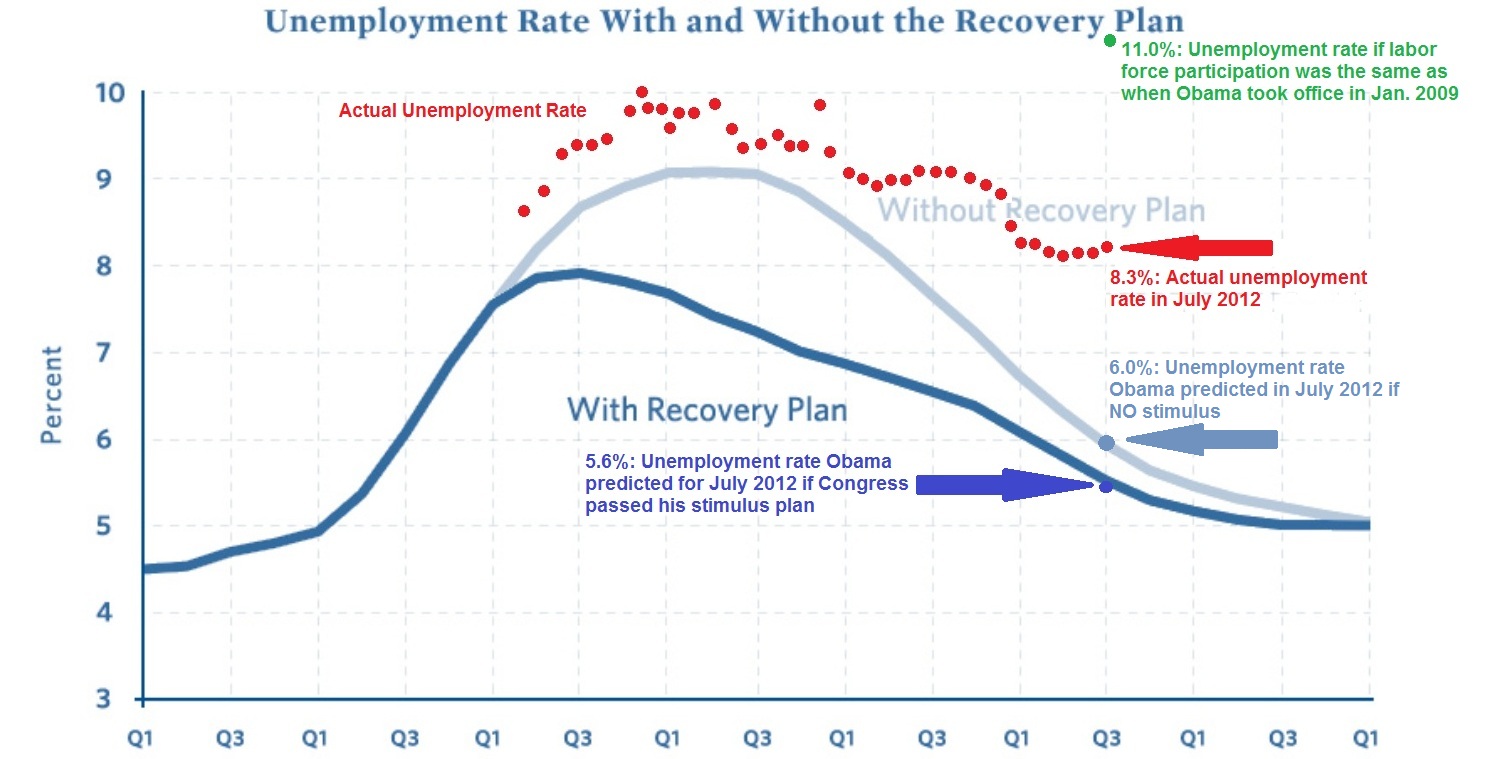
James Pethokoukis has the latest version of the chart originally created by Geoff at Uncommon Misperceptions, to which he's added a new wrinkle in its latest update: the green data point showing what the U.S. unemployment rate would be, if only the labor force participation rate had not fallen so much from where it was in January 2009 when Barack Obama was sworn into the presidency.

Pethokoukis' Big Chart

We thought we'd put that data point to the test. But, being us, we'd do the same math covering all the time since January 2002, just over 10 years ago, just to see how we had arrived at that point. Our results, showing the effects of keeping the U.S.' labor force participation rate at a constant 65.7% of the U.S. population, are below:

What Would the U.S. Unemployment Rate Be If the Labor Force Participation Rate Was the Same As it Was in January 2009?

What we find suggests that there might indeed be something to the President's apparent belief that his economic plan has worked, although only half as well as intended, it seems:

Here, we observe that the actual trajectory for the U.S. unemployment rate largely parallels the one he and his economic planners centered in Washington D.C. desired. Since the actual trajectory for the U.S. unemployment rate requires a significant decline in the United States' labor force participation rate in order for it to have fallen as it has, we must assume that was their intention.

The only problem for President Obama and his economic team is that too few Americans chose to exit the U.S. civilian labor force as they desired. In order to have achieved their goals, they would have needed to remove an additional 2% of the U.S. working age population from the ranks of the nation's civilian labor force.

That would be on top of the 2% of the U.S. working age population that they successfully removed from the U.S. work force since January 2009. With the current civilian labor force participation rate standing at 63.7%, that additional 2% reduction in the number of Americans in the civilian labor force works out to be roughly an additional 4.9 million people.

What can we say? Apparently, the President and his team have decided that culling the U.S. work force is a lot easier for them to do than generating real job-creating economic growth.

Senin, 20 Agustus 2012

Reading the Tea Leaves for the U.S. Economy

First, the good news! After several months of pacing near recessionary levels, the value of U.S. exports to China kicked up to double digit levels in May and June of 2012. That increase suggests that China's economy is growing more strongly for the first time since that nation effectively entered into recession in December 2011.

Annualized Growth Rates of US-China Trade, January 1985 through June 2012

The bad news is that the U.S. economy weakened in both May and June 2012, with the value of U.S. imports from China falling back to the single-digit levels that are consistent with near-recessionary conditions, as once again, international trade data confirms the scenario we first forecast more than a year ago.

We continue to anticipate that this will be a short-lived condition as the U.S. economy is likely to grow more strongly in the third quarter of 2012 before falling back toward those near-recessionary levels later in the year. At least, if the expected level of future quarterly cash dividend payments for the S&P 500 is any indication (and yes, they are!)

And now you know what to expect through the rest of this year!


Jumat, 17 Agustus 2012

Accounting for the National Debt

On 15 August 2008, the total U.S. public debt outstanding was just over $9.6 trillion (or if you're a stickler for accuracy, $9,606,975,957,798.46). Four years later, on 15 August 2012, the total public debt outstanding for the United States had risen to just over $15.9 trillion (or rather, $15,919,488,010,442.70). In four years then, the U.S. national debt rose by more than $6.3 trillion, or by 65.7% of its value in 2008.

To put those numbers on a more human scale, the amount of the U.S. national debt per American household has increased from $81,984 to $131,113 - the latter number being nearly equal to the cost of a 3 bedroom, 1-1/2 bath house in Hartville, Ohio. This represents a 59.9% increase over the last four years, as we estimate that the number of households in the U.S. has increased over the same time from 117,181,000 in 2008 to about 121,418,000 in 2012.

U.S. National Debt per Household, 2008 and 2012 (15 August of each year)

A good question to ask is how much of this increase in the national debt might be attributed to President Barack Obama, who was sworn in as the 44th President of the United States on 20 January 2009?

Typically, an incoming President bears little responsibility for the spending that occurs during their first year in office, since the budget that applies for that fiscal year will usually have been approved by the U.S. Congress in the previous year and signed into law by their predecessor.

How the U.S. government's budget for 2009 became law however was anything but typical.

Here, the Democratic Party-controlled Congress in 2008 only sent three of 12 appropriations bills for the 2009 budget year to President George W. Bush for his signature before he left office, deliberately withholding the remaining nine bills until after President Obama assumed office to avoid likely vetoes given the level of spending proposed in them. In 2009, the incoming Democratic Party-controlled Congress combined those nine bills into one "omnibus" bill, which President Obama signed into law on 11 March 2009.

Congressional Quarterly has a fairly detailed report of the FY2009 budget omnibus' appropriations bill history, but that requires a subscription to access. Here's the key quote from the article:

the omnibus provided a total of $1.05 trillion — $410 billion of it for discretionary programs — and included many of the domestic spending increases Democrats were unable to get enacted while George W. Bush was president.

So that accounts for $1.05 trillion of the U.S. government's spending in its 2009 fiscal year, which works out to be 32.6% of all federal spending in its 2009 fiscal year.

But that doesn't yet account for President Obama's economic stimulus package of 2009, which added some $825 billion to federal spending over its lifespan, above and beyond the U.S. government's annual budget.

Adding those two figures together, we find that Barack Obama, as President of the United States, may be held directly accountable for $1.875 trillion of the U.S. government's spending in 2009, or 53.3% of that year's federal spending. As a result, the federal government's spending during its 2009 fiscal year more closely represents President Obama's spending priorities than it does the previous President Bush's spending priorities.

That fact is especially driven home once we consider the voting record of Barack Obama in the U.S. Senate, where from 2006 through 2008, he supported or approved nearly every appropriations bill the Congress advanced. Or in the case of 2008, where he was often not present to vote for the increases in spending during this period as he ran for President, where he instead signed on to the massive increases in spending he desired after becoming President.

It is therefore reasonable to conclude that the combination of his voting record for government spending while in the U.S. Senate along with his spending record as President makes President Obama uniquely responsible for virtually all the federal government's spending and accumulated debt from Fiscal Year 2007 onward.

And that means that President Obama is uniquely and directly accountable for increasing the national debt burden of American households by $49,129 per household from 2008 through 2012.

References

U.S. Treasury. The Debt to the Penny and Who Holds It. [Online Application]. Accessed 16 August 2012.

U.S. Census. Historical Income Tables: Households. Table H-5. Race and Hispanic Origin of Householder--Households by Median and Mean Income: 1967 to 2010. [Excel Spreadsheet]. September 2011.

Project Vote Smart. President Barack Hussein Obama II's Voting Records. Accessed 16 August 2012.

Notes

Note: We projected the number of U.S. households by adding 1,368,000, the average annual change in the number of U.S. households from 1967 through 2010, to the recorded figure for 2010, twice (once for 2011 and again to estimate the number of households for 2012). The Census' official data for the number of households in 2011 will be published sometime in September 2012.

Kamis, 16 Agustus 2012

Men With and Without Wage and Salary Income

Now that we've tested our median income extraction math upon the U.S. Census' income data for women, we're going to repeat the exercise today for the Census' income data for men.

Our chart below shows what we found when we generated the inflation-adjusted median income data for both wage or salary earning men and what we extracted from the data for non-wage or salary earning men from the Census' Current Population Survey results for each year from 1947 through 2010, expressed in terms of constant 2010 U.S. dollars:

Men's Median Real Income in the U.S., with Recessions, 1947-2010

The chart is very different from what we observed for women. Starting first with the Census' published data for men with wage and salary income, we see that men just more than doubled their inflation-adjusted wage and salary incomes from 1947 through 1974, rising from $19,844 to just over $41,400, which corresponds to a real annualized growth rate of 2.6%.

But after that, men's median wage and salary income nose-dived in 1977 to a level around $35,000, plus or minus $2,000, about which it stagnated for the next twenty years. In 1997, it jumped up to a level around $38,000, about which it stagnated again in a range within $2,000 of that mark.

We should note at this point that the Census' data only counts money income - it does not include non-monetary compensation, such as health insurance benefits, that individuals earning wage or salary income commonly enjoy.

The more remarkable story though is for men with non-wage and salary income.

Here, we observe that men in this category had a much more slowly rising median income in the years from 1947 through 1965, increasing from an inflation-adjusted level of $16,155 to just $20,654, for a real annualized growth rate of just 1.4%.

In 1965 though, we find that non-wage or salary income earning men had a sudden jump to nearly $27,000 in their median incomes, after which we observe that this value has since settled into a range centered about $25,000, plus or minus $4,000 for all the years since.

That was surprising to us because we had expected that the median income data for this group would follow the same pattern we had observed earlier for women: basically flat up until after 1965, when the launch and growth of the U.S. government's Medicaid and Medicare programs might provide a steadily rising source of income for non-wage or salary earning men.

Instead, we find that other than what might be described as a one-time only benefit, the median income for men with non-wage or salary income has essentially stagnated since 1965.

We also find that non-wage or salary earning men would seem to be much more vulnerable to periods of recession than their wage and salary earning counterparts. Generally speaking, they see much deeper and longer periods of declines in their median incomes, indicating greater levels of economic distress.

We should note here that our non-wage or salary earning men include those who earn income from self-employment or through investments, which might account for much of that apparent greater sensitivity to economic downturns.

Rabu, 15 Agustus 2012

The Wages of Women

Today, we're showing off our newfound ability to extract median income data for a particular sub-population given just what we know for the full population and another sample sub-population within it!

That sounds pretty boring, right? What do you say we liven it up a bit by noting that the full population for our example today represents all women with money income of one kind or another in the U.S. for the years of 1947 through 2010, while the sample sub-population within that group represents the women who earned wage or salary income over that period of time?

From those two bits of officially published data, we can work out the median income of all the women whose income came from everything but wages and salaries! Our results are presented in the inflation-adjusted terms of constant 2010 U.S. dollars in the chart below, where we've shown the median income for the combination of both men and women along with the median incomes of all women, the median incomes earned by women with jobs (or rather, those with wage and salary income) and the median incomes of women without jobs:

Women's Median Real Income in the U.S., with Recessions, 1947 - 2010

Looking at the data for women with wage and salary income, we find that initially, the median income for women was largely flat for the years from 1947 through 1960, hovering around the $9,900 to $10,000 mark in the inflation-adjusted terms of 2010 U.S. dollars.

After 1960 though, we see a steady rise - one that seems to be largely resistant to recessions. As of 2010, the median income for women with wage and salary income has risen by a factor of nearly 2.7 to $26,973, for a real annualized growth rate of 1.9% per year.

Update 23 April 2013: What you're about to read next has turned out to be off target - instead of pacing changes in Medicaid and Medicare, the median income of the non-wage or salary earning women has instead turned out to be largely pacing changes in Social Security benefits paid to women over time, which have often coincided with changes in Medicaid and Medicare. See here for more information....

Looking at the new data we've extracted for the median incomes of women with non-wage or salary income, what we find is really the story of Medicaid and Medicare over time.

Here, we see that after initially dipping in the years from 1948 through 1951 and recovering in 1952, the median incomes for women with non-wage or salary income was essentially flat at a level around $4,500 from then through 1965. Beginning in 1966 however, we find that the median incomes of these non-wage or salary earning women began to rise, reaching $12,924 in 2010, which works out to be a real annualized growth rate of 2.4% since 1965. As it happens, the timing and magnitude of that rise coincides with the launch of both Medicaid and Medicare in the late 1960s.

In fact, we can see much of the growth in the median incomes of non-wage or salary earning women paces the U.S. government's average spending per Medicare beneficiary for each year from 1966 through 2010:

Annual Medicare Spending per Beneficiary, 1966-2010

And so, we see that government assistance in the form of Medicaid and Medicare is largely responsible for much of the observed growth of the median income of non-wage or salary earning women over the last 45 years.

Still think what we're doing is boring?

Notes

The published data for women's wage and salary income has a pretty unique anomaly for the years 1974, 1975 and 1976. It appears that the U.S. Census' data jocks were off by 10,000,000 in their estimates of the number of working women in each of those years, or about 25% of the actual figures, which in turn, led the Census to over-estimate the median income for women in those years by a similar percentage.